Card
Instead of plain text messages/outputs you can add Card to accept inputs or show some output. They provide a neat way to embed images, gifs, and videos.
Card Dialog Element can be used in various scenarios like:
- Display an entire form to fill in one card
- Add images
- Structure the information in hand in a better way
- Carousel of multiple cards (in case of lists)
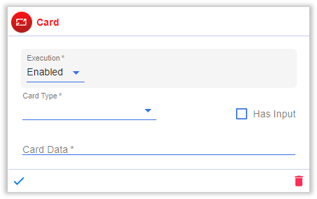
Following is a screenshot of the Card dialog element in its default state:
This dialog element can be customized using the following fields:
- Execution: Configuration to decide when to execute the respective Dialog Element. The options are as follows,
- Enabled: The Dialog Element will be executed everytime the dialog is executed.
- Disabled: The Dialog Element will never be executed even if the dialog is executed.
- Condition: Depending on a certain condition, the Dialog Element is executed.
infoFor a detailed explanation of Conditions, click here.
- Card Type: Three types of cards are supported by AI Studio,
- Adaptive: Adaptive Card is a snippet of content that users can add to a conversation through a bot. This card is highly customizable and can contain any combination of text, speech, images, buttons, and input fields.
- Hero: Hero cards typically have a single, large image, one or more buttons, and not much text.
- Adaptive List: Adaptive List contains a carousel of homogeneous Adaptive Cards.
- Has Input: Enable this option to collect input from the user during the card interaction.
- Max Attempts: Specify the maximum number of attempts allowed for user to enter a valid input. If this option is not specified, the default behavior allows the user to keep trying until a valid input is provided.When the user exceeds the maximum allowed invalid input attempts, the chatbot exits the current dialog, and the user needs to restart the conversation.
- Card Data: You need to add the JSON of the customized card here.
You can use https://adaptivecards.io/designer/ to design your Adaptive Card. Copy the contents of the CARD PAYLOAD EDITOR to the Card Data field. We support only version 1.3 for Adaptive cards. Make sure to select the Target Version as 1.3 on the Adaptive Card Designer site.
- List Variable: If Adaptive List is selected in Card Type, this option is shown. You can provide any state variable which contains the data to be displayed as input which contains a list of data needed in each adaptive card.
In the case of an Adaptive List, the user can access individual list item data as ${list.attribute_name}.
For example, the carousel we need to show is the Ticket ID which we have received as follows,
{
      "tickets":[
          {
            "id":"INC0001",
            "description":"Problem with laptop"
          },
          {
            "id":"INC0002",
            "description":"Cannot connect to internet"
          },
          {
            "id":"INC0003",
            "description":"Mouse not working"
          }
      ]
    }
To show one card for each ticket (id and description) in a carousel,
- Select Card Type as Adaptive List
- Assuming the data is coming from the Conversation state variable
ticket_details, set List Variable as${conv.ticket_details.tickets} - In Card Data JSON to access the values enter the following,
- id : ${list.id}
- description : ${list.description}